The timeseries generator
Use it when you need values that move like a real signal over time — daily
sales, sensor readings, web traffic. Real series aren't flat noise or a single
distribution: they're layers — an overall trend (rising or falling), a
repeating season (weekly, yearly), and random noise on top. timeseries builds a
row's value exactly that way:
value(i) = base + trend·i + amplitude·sin(2π·i / period) + noise·random
where i is the row number (the time axis), counted from zero — so the first row
(i = 0) is exactly base.
Example outputs below are illustrative: exact digits can differ by core version and
seed, but the shape — the trend, the wave, the jitter — is what matters.
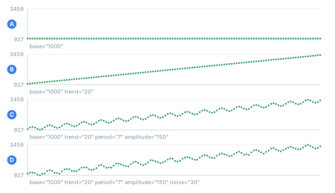
- Abase alone: a flat line
- Btrend added: the line starts climbing
- Cperiod and amplitude added: a wave rides on the trend
- Dnoise added: the wave stops being perfect
Why not just random numbers
A plain number generator produces white noise — values that
jump around a mean with no memory. Here's number with a normal distribution
centered on 1000:
<sequence name="Noise"><gen type="number" distribution="normal" mean="1000" sd="120"/></sequence>
Day 1     841
Day 2     1341
Day 3     1047
Day 4     1010
Day 5     1086
Day 6     1077
Day 7     862
Day 8     1072
Day 9     1114
Day 10    782
Day 11    979
Day 12    1014
No rise, no fall, no repeat — every day just churns around 1000. Real metrics don't
look like that: sales have a trend (the business grows), a weekly rhythm (weekends
differ from weekdays), and only on top of those some random deviation. Those three
layers are exactly what timeseries adds.
Attributes
<gen type="timeseries" base="1000" trend="20" period="7" amplitude="150" noise="30"/>
| Attribute | What it sets |
|---|---|
base | Starting level (default 0) |
trend | Slope: how much the value rises each step |
period | Length of the seasonal wave, in rows (e.g. 7 = a week) — or several, 7,365 |
amplitude | Height of the seasonal wave — one per period |
peak_at | Which row the wave peaks on (default: a quarter period in) — one per period |
noise | Strength of the random noise (standard deviation) |
noise_correlation | How much of one row's noise carries into the next, -1..1 (default 0) |
decimals | Digits after the decimal point (default 0 — integer) |
Every layer is optional. The sections below take them one at a time — what each does, and when you'd reach for it.
base — the starting level
base fixes the value of the very first row (i = 0), and it's the level everything
else is measured from. On its own — no trend, no wave, no noise — it's just a
flat line.
<gen type="timeseries" base="500"/>
500
500
500
500
500
Use it to anchor a metric at a realistic level — a store that averages 500 orders a day, a sensor that idles at 20 degrees — before you add movement.
trend — direction
trend is the slope: each row adds trend to the last. Positive climbs, negative
falls. With only base + trend you get a dead-straight line.
<gen type="timeseries" base="1000" trend="20"/>
1000
1020
1040
1060
1080
Use it for growth or decay you want to be obvious at a glance — a subscriber count that gains 20 a day, a battery that drains a fixed amount each cycle.
period and amplitude — the seasonal wave
These two work as a pair, and neither does anything without the other. period is
how many rows one full cycle takes (7 = a weekly rhythm, 365 = a yearly one);
amplitude is how far the wave swings above and below the trend line. Together they
lay a repeating sin wave on whatever base + trend gives you.
<gen type="timeseries" base="1000" trend="20" period="7" amplitude="150"/>
1000
1137
1186
1125
1015
954
1003
Within each 7-row window the value rises to a peak and falls to a trough, then repeats. Because the trend keeps lifting the whole line, each cycle sits higher than the last — the wave rides up the slope. Use it for anything with a calendar rhythm: weekday-vs-weekend traffic, summer-vs-winter demand.
peak_at — which row the wave is highest on
period and amplitude say how long the wave is and how far it swings. They do not
say WHEN it peaks, and the default answer surprises people: the wave starts at the
middle of its swing and climbs, so it peaks a quarter period in.
Over twelve monthly rows that is row 3 — April. "Warmer in summer" is what the config was for, and April is not it:
<gen type="timeseries" base="15" amplitude="10" period="12" decimals="1"/>
15.0
20.0
23.7
25.0
23.7
20.0
15.0
10.0
6.3
5.0
6.3
10.0
peak_at names the row instead. Rows count from zero, so July is row 6:
<gen type="timeseries" base="15" amplitude="10" period="12" peak_at="6" decimals="1"/>
5.0
6.3
10.0
15.0
20.0
23.7
25.0
23.7
20.0
15.0
10.0
6.3
Nothing else moved: same base, same amplitude, same twelve-row cycle. Only the
month the maximum lands on.
It is a row, not an angle. period is already counted in rows, so peak_at is
too — 182 of 365 is the first of July, and that is a number you can work out from a
calendar rather than from radians. A value beyond the period wraps, so peak_at="18"
over period="12" is the same as 6, and a fraction is allowed when the peak sits
between two rows.
peak_at="0" is worth knowing separately: it makes the wave START at its maximum,
a shape a plain sine cannot produce at any amplitude.
phaseThat is the signal-processing name and TDC does not have it. peak_at does the same
job in the unit the rest of the generator uses. Writing phase= is an error that
says so.
peak_at needs a period — a wave has to have a length before it can have a highest
point. Without one it is TDC253.
noise — real-world roughness
noise is the standard deviation of a random wobble added to every row. It's the
difference between a textbook curve and a real measurement.
<gen type="timeseries" base="1000" trend="20" period="7" amplitude="150" noise="30"/>
1048
1152
1210
1093
1017
978
991
Compare with the clean wave above: the shape is the same, but each point jitters a
little (1000 → 985). Turn it up for a noisy sensor, down for a smooth aggregate.
The jitter is reproducible — see Details.
decimals — fractional values
By default the output is rounded to a whole number. decimals keeps that many
digits after the point — for temperatures, prices, or any measured quantity.
<gen type="timeseries" base="20" trend="0.5" noise="0.3" decimals="1"/>
20.5
20.6
21.2
21.2
22.0
Build it up one layer at a time
The clearest way to get a feel for the generator is to switch the layers on one at a
time. Below, three <sequence> columns run over the
same "days": trend (only trend), +season (add period + amplitude), and
+noise (add noise).
<sequence name="A"><gen type="timeseries" base="1000" trend="20"/></sequence>
<sequence name="B"><gen type="timeseries" base="1000" trend="20" period="7" amplitude="150"/></sequence>
<sequence name="C"><gen type="timeseries" base="1000" trend="20" period="7" amplitude="150" noise="30"/></sequence>
...
<data>Day ${{Day}}   trend=${{A}}   +season=${{B}}   +noise=${{C}}</data>
Day   trend   +season   +noise
01    1000     1000      985
02    1020     1137      1087
03    1040     1186      1192
04    1060     1125      1107
05    1080     1015      936
06    1100     954       966
07    1120     1003      1031
08    1140     1140      1087
09    1160     1277      1311
10    1180     1326      1347
11    1200     1265      1261
12    1220     1155      1126
Reading the columns:
- trend — a dead-straight line:
+20each day,1000, 1020, 1040 …. There's a direction, but no life to it. - +season — a weekly wave (
period="7") laid on the line. Within each week the value climbs to a peak and falls to a trough: peaks land on days 3 and 10 (1186 → 1326), the trough on day 6 (954). Peaks and troughs repeat every 7 rows, and each one sits higher than the last by exactlytrend · period = 20 · 7 = 140— the wave rides up the trend. - +noise — the same shape, but it jitters slightly (
1000 → 985), the way real measurements do.
Each column is the previous one plus one attribute — direction, then rhythm, then real-world roughness. That's how a realistic series is assembled.
Several seasons at once
Real series rarely carry one season. A shop takes more on Saturdays and more in
December; a power grid has a daily cycle and a yearly one. Write both: period,
amplitude and peak_at each take a comma-separated list, one entry per wave, and
the waves add up.
<gen type="timeseries" base="1000" trend="2"
     period="7,365" amplitude="120,400" peak_at="5,182" decimals="0"/>
That is a weekly wave 120 tall peaking on day 5, and a yearly wave 400 tall peaking on day 182 — on the same column.
day 0: 573
day 1: 494
day 2: 496
day 3: 580
day 4: 684
day 5: 732
day 6: 689
day 7: 591
day 8: 512
day 9: 515
day 10: 600
day 11: 705
day 12: 753
day 13: 712
day 14: 614
day 15: 536
The weekly peaks are plain to see — days 5, 12 and 19 — and each week sits a little higher than the last, because the yearly wave is still climbing towards day 182.
The three lists describe the same waves, position by position, so they have to
line up: period="7,365" needs two amplitudes. A single amplitude is the one
shorthand — it gives every wave the same height. Anything else is a mistake the
engine will not guess at (TDC304).
Noise that remembers — noise_correlation
Plain noise is independent: each row is jittered on its own, so a high reading
tells you nothing about the next one. Real measurement error rarely behaves like
that. A sensor drifting warm stays warm for a while; a queue that is backing up keeps
backing up. Code tested only against independent noise has never met the case it will
actually fail on.
noise_correlation says how much of one row's noise carries into the next — 0 is
the independent noise this generator has always produced, 0.9 is strongly
correlated. It is the AR(1) model, if you know the name; if you don't, read it as
"how sticky the jitter is".
<sequence name="White">  <gen type="timeseries" base="20" noise="2" decimals="1"/></sequence>
<sequence name="Drifty"> <gen type="timeseries" base="20" noise="2" noise_correlation="0.9" decimals="1"/></sequence>
independent 17.8   correlated 22.4
independent 18.5   correlated 21.0
independent 20.8   correlated 21.8
independent 21.1   correlated 20.3
independent 19.3   correlated 22.6
independent 18.4   correlated 23.9
independent 20.4   correlated 23.2
independent 18.7   correlated 21.5
independent 21.6   correlated 20.9
independent 23.1   correlated 20.7
independent 20.0   correlated 20.6
independent 23.2   correlated 20.2
independent 22.4   correlated 18.9
independent 20.0   correlated 18.7
independent 18.5   correlated 18.4
independent 18.5   correlated 18.5
The left column jumps about 20 at random. The right one wanders: up to 23.9, then down over ten rows to 18.4. Both have the same spread — correlation changes how the noise moves, not how big it is.
The small print
- It needs
noise=. Correlation of what, otherwise? Refused rather than ignored (TDC305). - Between −1 and 1, and not 1 itself: at 1 the series would wander off and never come back, which is a random walk and not noise.
- A negative value alternates — each row leans against the one before it, which is what over-corrected control loops look like.
- Both engines, any size. The correlated value is still computed from the row number, so a streamed run of a billion rows produces the same file as an in-memory one, and memory stays flat. It remembers the last 64 rows: far enough that the weight of anything older is negligible, near enough that the cost is about 20 nanoseconds a row.
Details
- Deterministic: the same
seedgives the same series. The noise is reproducible too — it's computed from the row number, not rolled on the fly. - Any size, either engine: a value is computed from its row number, so memory doesn't grow (see Large outputs). A billion points is no problem.
- The time axis is the row number. It pairs naturally with an
increment(a day counter) or adatecolumn beside it, so each value carries a real date.