The pattern generator
Use it when a signal has a shape you can't describe with a formula — demand by hour, a demographic wave, a screenshot of a stock chart, any "wiggly" line. You draw the picture, and its shape is stretched across all rows: the horizontal axis is the row number (first … last), the vertical axis is the value. The drawing can be tiny; the rows can number in the millions.
Nothing is pre-rendered into a file. The picture is read when the run starts, and each row computes its own point on it, so a million rows cost no more memory than ten.
Example outputs below are illustrative and can differ slightly by core version; the shape is what's guaranteed.
Why draw a shape instead of picking a distribution
Ready-made distributions (normal, poisson, …) have a fixed shape — a bell, a
decaying tail. A real signal often needs a shape that isn't in that list: two humps
where the right one is taller, a plateau with a spike at the end, demand that
rises toward noon and falls at night. You can't get "two humps of different heights"
out of normal. pattern removes that limit — you draw the silhouette yourself, and
it's stretched across the rows as-is.
How to turn it on
Every <gen> with type="pattern" takes exactly
one source of shape. The usual one is a file — draw in any editor, or
screenshot a chart, and hand the file over:
<!-- a drawing you made: SVG or PNG -->
<gen type="pattern" src="chart.svg" y_range="0..40"/>
For a shape simple enough to type, the same generator accepts points inline — a
single line with points, or a band with upper / lower:
<gen type="pattern" points="0,5  20,40  40,8  60,45  80,15  100,5" y_range="0..40"/>
<gen type="pattern" upper="0,20 50,40 100,20" lower="0,5 50,10 100,5" y_range="0..40"/>
| Attribute | What it sets |
|---|---|
src | An SVG or PNG file — the usual way to give the shape |
points | Pairs x,y typed inline instead of a file: x across, y height |
upper / lower | Two boundary curves typed inline — a corridor |
mode | signal (default) — a trajectory; density — a distribution |
y_range | Required. min..max — what the drawing's canvas floor and ceiling become |
fit | low..high — where a drawing read from src lands (below) |
interp | linear (default) / smooth / step — how the line behaves between points |
spread | Randomize every row by ±N in y_range units (default 0 — an exact line) |
ink_threshold | 0..1 — how dark a PNG pixel must be to count as ink (default 0.5) |
decimals | Digits after the decimal point (default 0) |
src — the picture is the config
Two formats are read, and both end up as the same thing internally — a vector outline:
- SVG — read from its real geometry:
<path>,<polyline>,<polygon>,<line>,<rect>(rounded corners included),<circle>,<ellipse>. Bezier curves and arcs are followed as drawn, andtransformon a shape or on any enclosing<g>is applied. Draw in Illustrator, Figma, Inkscape, or by hand — export and go. One rule tells the shapes apart: when a single line is being read, the primitives (rect,circle,ellipse) count as furniture — a chart export's frame and background — and anything actually drawn outranks them; in a band every shape counts, because the drawing is the region. - PNG with a transparent background — the drawn pixels are the shape and the
transparency is empty space. That's what a screenshot cropped to a chart, or a
brush stroke exported from any raster editor, looks like. A PNG with a solid
background falls back to darkness instead: dark pixels are ink, light ones are
background, and
ink_thresholdmoves the cutoff.
An SVG's y axis grows downward, the way every drawing program stores it. TDC
flips it, so "higher on the screen" always means "a larger value".
A whole example, end to end
This is a real file — 240×140 pixels, a stroke on a transparent background and nothing else. No axes, no labels, no frame: everything opaque in the file is read as part of the drawing.
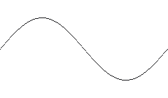
<gen type="pattern" src="line-input.png" y_range="0..100"/>
Run it for 40 rows and plot the result against the drawing. The green dots are the generated values; the orange line is the picture:
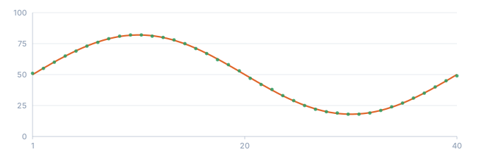
- the line drawn in the file
- generated values (40 rows)
The picture is 240 px wide and the run is 40 rows, but neither number has to match the other: ask for 40 rows or 4,000,000 and the same drawing is stretched across them.
The same thing from a vector file
An SVG is not approximated. This one is a single cubic Bezier inside a <g> that
flips the y axis — the two things a drawing program emits constantly:
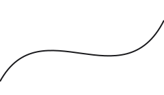
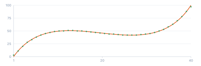
- the Bezier from the file, with its transform applied
- generated values (40 rows)
A drawing is read column by column
TDC never guesses whether your picture is "one line" or "a band". It measures, and the measurement answers the question on its own.
For each column of the drawing it takes two readings: from the top down to the first mark it meets, and from the bottom up to the first mark it meets.
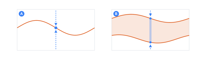
- Athe readings meet on one pixel — the value is exact
- Bthe readings stand apart — the value is random between them
- the readings themselves: top-down and bottom-up
- Both readings land on the same spot → that column is an exact point on the graph. Every row that falls there gets that one value, with no randomness.
- The readings land apart → that column is a band. A row falling there gets a
random value between the two edges, fixed by the
seed.
So a picture with two strokes is a corridor, and each row picks a random value between them. Here is the input file and 300 rows generated from it:
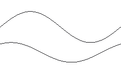
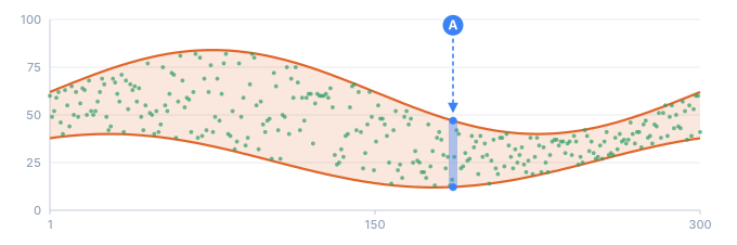
- the band drawn in the file
- generated values (300 rows)
- Aone column: the value is taken between its edges
Two consequences worth knowing:
- One picture can be both. A line that runs alone and then splits into two branches gives exact values while it's a single stroke, and random ones once it opens up — no attribute needed, no mode to pick.
- Anything closed is a corridor. Draw a car, a leaf, a blob: it has a top edge and a bottom edge, so it reads as a band between them. That is not a figure of speech — here is a car:

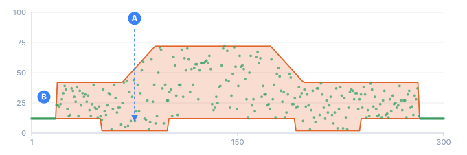
- the drawn car
- generated values (300 rows)
- Aa wheel lowers the bottom edge of the body
- Bthe ground before and after the car is a single line, so the values are exact
Here's a line that runs flat and then forks — one branch up, one branch down:
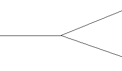
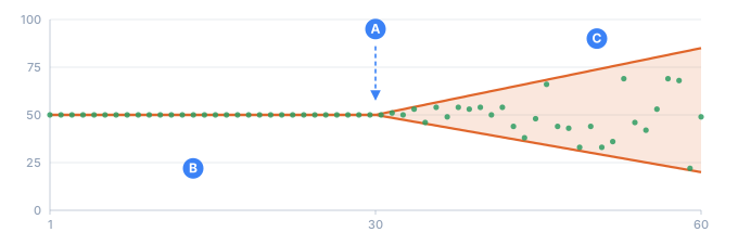
- the lines from the file
- generated values (60 rows)
- Athe line forks here
- Bbefore the fork — the same exact value every time
- Cafter it — random inside the widening band
The same run on two different seeds shows it plainly — the first half is identical, the second half is not:
seed A:  50  50  50  50  50  50  44  47  66  18  45
seed B:  50  50  50  50  50  51  57  61  60  81  35
Typing a corridor inline: two attributes, never one string
A corridor drawn in a file needs no attributes at all — two strokes in the picture
already read as two edges. Typed inline it needs two attributes, upper and
lower, one curve each:
<gen type="pattern" upper="0,80 100,80" lower="0,20 100,20" y_range="0..100"/>
The tempting shorthand — one points with a separator between the two lines —
does not exist, and a ; is refused rather than ignored:
error[TDC285]: pattern: ";" does not separate two lines in points= — every number is read as one curve. For a band, draw the two edges separately: upper="0,80 100,80" lower="0,20 100,20".
The same check catches a drawing with no width — every point on the same x:
error[TDC285]: pattern: every point sits at x=50, so the drawing has no width and a card has nothing to read across. Give the points at least two different x coordinates.
Both are reported by check as well as by the run: points,
upper and lower are read before a single row exists, by the same code the run
uses.
y_range — the scale, and it is required
A drawing carries no scale of its own. The same curve leaves one tool running
0..100, another 0..480, a third 0..10002345345, and none of those numbers mean
anything until you say what the axis is. y_range="min..max" is that statement, which
is why it is required rather than optional: without it every answer would be a guess
about somebody's export settings.
What it scales is the canvas, not the ink:
| the drawing came from | canvas floor | canvas ceiling |
|---|---|---|
| a PNG | bottom of the image | top of the image |
| a vector file (SVG) | the drawing's own lowest point | the drawing's own highest point |
points / upper / lower | 0, grown down if you drew below it | 100, grown up if you drew above it |
For a typed-in drawing the canvas is a percentage board: 0..100 by default, and it only ever grows to hold what you drew outside it — it never shrinks. That is what makes a flat line at 50 the middle of whatever range you ask for. Measured against the ink instead, that same line would be the highest thing present, and so the top.
The three rows differ because the three inputs carry different things. A PNG is exactly
as tall as it says it is, so its frame is a real canvas and whitespace above a stroke
genuinely lowers that stroke's values. A vector file carries no frame worth trusting —
most editors crop the viewBox to the artwork on export, and a cropped one cannot be
told apart from a deliberately tight one — so the drawing itself is measured, and
fit is how you place it.
<gen type="pattern" points="0,0 50,100 100,0" y_range="0..40" decimals="1"/>
<gen type="pattern" points="0,0 50,100 100,0" y_range="-2..2" decimals="1"/>
0..40    0.0   8.0   16.0   24.0   32.0   40.0   32.0   24.0   16.0   8.0   0.0
-2..2   -2.0  -1.2   -0.4    0.4    1.2    2.0    1.2    0.4   -0.4  -1.2  -2.0
Nothing leaves the range, whatever coordinates you drew in. Combine y_range with
decimals when you need continuous values rather than whole numbers.
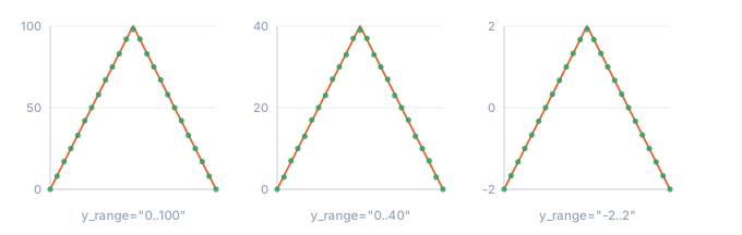
- the same drawn triangle
- generated values (25 rows)
y_range always means the range of the values you get. In mode="density" the
value axis is the drawing's width rather than its height, so there the range is
stretched across the picture from left to right — the attribute keeps its meaning
even though the axis changes.
fit — where a drawing from a file lands
A drawing carries a shape. It carries a position only if it also carries a board — and a file exported from someone else's editor does not. Not the units, not the origin, not even which way is up. So there are only two things about it that can be measured: its own lowest point and its own highest point.
fit="low..high" says what those two become.
<gen type="pattern" src="foreign.svg" y_range="200..300" fit="255..297"/>
The lowest point of the drawing comes out as 255, the highest as 297, and nothing
in between can leave that band — whatever coordinates the file was drawn in, 0..1000
or -5..3e6. The shape survives; the placement is what you declared.
Leave fit out and the drawing fills y_range: lowest to the floor, highest to the
ceiling. That is a stated convention rather than a guess — it invents no information.
| canvas (what gets mapped) | fit absent | fit present | |
|---|---|---|---|
| a vector file | the drawing itself | it fills y_range | its ends land on the band |
| a PNG | the image frame | the frame fills y_range | the frame lands on the band |
Under mode="density" it follows the same axis y_range does. There the value axis is
the drawing's width, not its height, so fit places its left and right edge instead
of its lowest and highest point. fit is simply a narrower y_range for a drawing read
from src — it changes axis exactly where y_range changes axis, and never separately.
fit is refused beside points / upper / lower (TDC300).
A typed point is already a percentage of the 0..100 board — 80 means 80% of y_range —
so there is nothing left to place, and writing both would be a config saying two things
at once.
A corridor drawn in a file needs it
Two strokes in one file are a corridor, and a band measured against itself is always the
whole band. So without fit a banded SVG fills y_range — correct by the rule above,
and rarely what you wanted. fit carries in the config exactly what the typed spelling
carries in its numbers:
<gen type="pattern" upper="0,80 100,80" lower="0,60 100,60" y_range="0..100" decimals="1"/>
<gen type="pattern" src="band.svg" y_range="0..100" fit="60..80" decimals="1"/>
typed   62.3  62.5  73.4  76.0  71.7  75.0  61.3  64.3
drawn   62.3  62.5  73.4  76.0  71.7  75.0  61.3  64.3
Digit for digit, and the same in all five implementations — the pair is a shared fixture.
SVG counts y downward — the top of the file is y=0. The engine flips it, so what
looks higher in your editor comes out larger in the data. You never write this down; it
is worth knowing when a drawing comes out upside down and you are checking the file.
decimals — digits after the point
decimals sets how many fractional digits each value keeps (default 0, i.e. whole
numbers). Reach for it when the curve feeds a price, a temperature, or any measured
quantity where rounding to integers would flatten the shape.
<gen type="pattern" points="0,0 50,100 100,0" y_range="-1..1" decimals="2"/>
-1.00 -0.60 -0.20 0.20 0.60 1.00 0.60 0.20 -0.20 -0.60 -1.00
The middle row sits on the apex and reads 1.00, because that is where its line crosses
the drawing. Stretching,
below, is that rule in full.
Stretching — the drawing rarely has as many points as you have rows
Row i of count reads the drawing at t = i / (count − 1), and its value is where
its own vertical line crosses the line you drew. Ten rows are ten crossings; you can
check them on the picture with a ruler. There is no second rule underneath.
More drawn detail than rows → you get the crossings, not a summary. A five-tooth zigzag squeezed into five rows reports the five places those rows land, each of which is a real point of the zigzag:
<gen type="pattern" points="0,0 10,100 20,0 30,100 40,0 50,100 60,0 70,100 80,0 90,100 100,0"
     y_range="0..100"/>
0 50 100 50 0
Widen the same run to 40 rows and the teeth come through, because now the rows are close
enough together to land on them: 0 26 51 77 97 72 46 21 5 31 56 82 …
Missing a peak that falls between two rows is not a lost measurement — it is what asking for five rows means. Draw in more detail, or ask for more rows: at a million rows the same drawing spells itself out completely, every peak included. The point of the rule is that you can look at your own drawing beforehand and say what will come out.
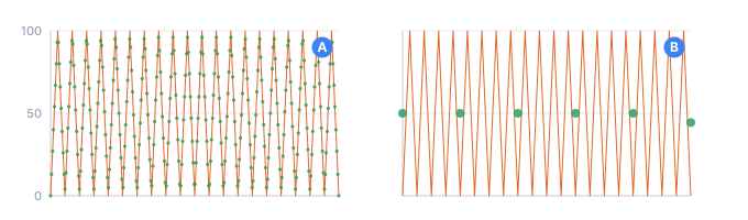
- the drawn zigzag
- generated values
- A300 rows — the teeth come through
- B7 rows — seven crossings, and the rest fall between them
More rows than drawn points → interpolation, which is where interp comes in.
interp — how the line behaves between two drawn points
Between two points drawn far apart there may be thousands of rows. Left alone, a
straight segment climbs by exactly the same amount every row — mathematically
correct and visibly synthetic. interp picks the behavior:
| Value | What it does |
|---|---|
linear (default) | Straight segments — a constant rate between two points |
smooth | A curve through the points that eases in and out, never overshooting |
step | Holds each point's value until the next one — a staircase |
smooth uses a monotone cubic: it rounds the corners and varies the rate, but it can
never take the line above or below the values you actually drew, so no phantom peak
appears out of a bend. The same three-point drawing over 11 rows:
linear:  0   8  16  24  32  40  52  64  76  88  100
smooth:  0   8  15  23  31  40  50  62  75  88  100
step:    0   0   0   0   0  40  40  40  40  40  100
Note where step ends. A staircase holds each point's value in the band to its
right, and the last point has no band — the drawing stops there. So the last point
is read at the one place every run visits: the right edge itself, where the final row's
line crosses it. All three modes agree there, on the last thing you drew.
On a drawing with real corners the three are unmistakable — the dashed line is what was drawn, the dots are what came out:
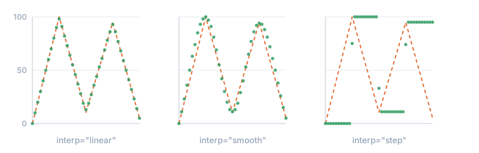
- what was drawn: a polyline through five points
- generated values (41 rows)
Look at the step sizes: linear repeats 8, 8, 8, 8 — perfectly predictable.
smooth goes 8, 7, 8, 8, 9, 10, 12, 13 — it leaves the point gently, accelerates,
and arrives gently.
spread — turn one line into a tunnel
spread="N" randomizes every row by ±N, in the units of your y_range. Default
0: the line is exact and 100% predictable. Set it, and the drawn line becomes the
center of a band — so you don't have to draw both edges of a corridor just to get
some wobble.
It follows whatever scale you declared: on y_range="0..100" a spread of 1 is one
point of noise; on y_range="0..1" you'd write spread="0.001" for the same
relative effect.
<gen type="pattern" src="ramp.svg" y_range="0..100" spread="5"/>
spread 0, seed A:   0  10  20  30  40  50  60  70  80  90  100
spread 5, seed A:   5  13  16  29  37  52  57  69  83  86   99
spread 5, seed B:   5  11  21  26  45  53  64  73  82  94   99
The single stroke of line-input.png again, this time with spread="6":
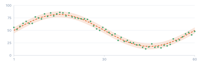
- the drawn line — the center
- the ±6 corridor you never drew
- generated values (60 rows)
The trend is untouched; each row just sits somewhere inside ±5 of it. Like the
corridor, the scatter is deterministic — the same seed reproduces it exactly.
spread also works on a drawing that is already a band: it widens the band by N on
both sides.
ink_threshold — the dark/light cutoff for PNGs
When a PNG has a solid background, ink is decided by darkness. ink_threshold is the
cutoff on a 0..1 scale (default 0.5): a pixel counts as ink when it is at or
darker than the cutoff. So raise it toward 1 to take in faint, anti-aliased
edges and light gray, and lower it toward 0 to keep only near-black strokes. It
has no effect on a PNG drawn on transparency, where the alpha channel already says what
is drawn.
<gen type="pattern" src="faint-curve.png" ink_threshold="0.8" y_range="0..100"/>
This file has two strokes on a white canvas — one black, one light gray — and the threshold decides whether the gray one exists at all:
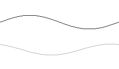
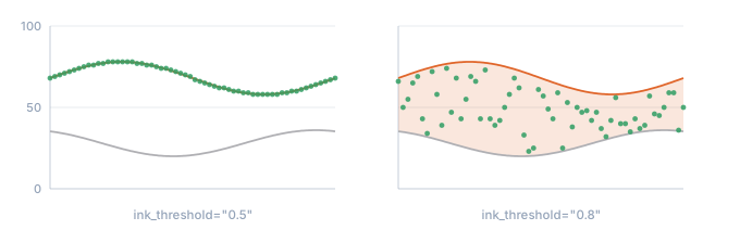
- the black stroke
- the light gray stroke
- generated values (60 rows)
The signal is a trajectory, not a histogram
A row's value is the curve's height at its position in order. So the numbers come out along the curve, like the trail of a pen — a trajectory, not "a pile of values". If you took those same numbers and, ignoring their order, built a histogram (how often each value occurs), it would not reproduce the curve's shape. Here's the real histogram of a two-hump drawing over 300 rows:
0  | ################################## 29
3  | ######################################## 34
7  | ######################################## 34
10 | #################################### 31
13 | ######################### 21
17 | ########################## 22
20 | ################################# 28
23 | ########################## 22
27 | ######################### 21
30 | ################################## 29
33 | ################### 16
37 | ############### 13
No two humps — the histogram is nearly flat. That's not a bug: the signal passes
through each height about equally often, so the pile of its values doesn't look
like the drawing. When you want the drawing to set frequency instead, that's the
other reading — mode="density", below.
mode — the two questions you can ask a drawing
The same picture answers two different questions, and mode picks which one:
| Mode | The question | What comes out |
|---|---|---|
signal (default) | "what value does this row get?" | 0, 20, 40, 70, 90, 100, 90, 70, 40, 20, 0 — walks along the line, in order |
density | "how often does this value come up?" | a pile of numbers clustered around the drawn hump, in random order |
In density the axes swap meaning: the horizontal axis is the value, and the
curve's height is how often that value occurs. Draw a hump over the middle and
most numbers land in the middle; draw two humps of different heights and the taller
one gets proportionally more. It's "draw your own probability" instead of picking
normal / poisson off a list.
<!-- a triangle standing between x=25 and x=75 -->
<gen type="pattern" points="0,0 25,0 50,100 75,0 100,0" y_range="0..100" mode="density"/>
  0- 9 |
10-19 |
20-29 | ## 85
30-39 | ########################### 901
40-49 | ########################################################## 1911
50-59 | ############################################################ 1955
60-69 | ############################## 978
70-79 | ##### 170
80-89 |
90-99 |
The values themselves come out shuffled — 60 57 36 49 48 40 67 53 … — because a
distribution has no order. And nothing appears outside 25..75: the drawing is flat
there, and a flat stretch means "never".
The same thing with a picture instead of typed points. Here is a hump drawn as a filled shape:
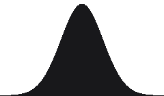
<gen type="pattern" src="hump-input.png" y_range="0..100" mode="density"/>
Generate 6,000 rows from it and count how often each value came up:
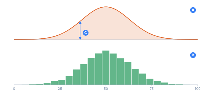
- Awhat is drawn in the file
- Bhistogram of 6000 generated values
- Cthe height of the drawing here = how often that value comes up
That is the whole idea: the silhouette you paint becomes the histogram of the data. No formula was chosen anywhere.
And the height is proportional, not just positional — draw one hump twice as tall as the other and it takes about twice as many of the values:
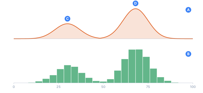
- Awhat is drawn: two humps of different height
- Bhistogram of 6000 generated values
- Cthe left hump
- Dthe right one, twice as tall — and twice as many values
Things worth knowing about density:
- Zero is the picture's floor. For a PNG that's the bottom edge of the image; for an SVG or inline points it's the lowest point of the drawing. Wherever the curve is at its lowest, that value never occurs — so bring your curve down to the baseline at the edges of the range you want.
- A band contributes its top edge. If the drawing is a corridor, the outline is what shapes the distribution.
interpstill applies, and it moves real weight.smoothgives a rounded distribution rather than a polygonal one — but if the drawing is a BAR CHART, one declared share per bar, useinterp="step". It is the only mode that holds a value across the whole bar;linearandsmoothrun a line THROUGH each point, so a peak bleeds into its neighbours. Measured on ten bars, 200,000 rows, a peak declared at 40%:stepkept the two centre bars at 28.4% and 27.9%,smoothconcentrated them into 41.5% and 10.0%. Same points, different shares — the choice is not cosmetic.spreadis refused here. The drawing is already the scatter, so combining the two is a mistake rather than a feature.- A flat drawing means "no preference" and gives a uniform spread across the range instead of an error.
- Deterministic and streamable like everything else: the same seed reproduces the same pile, at any row count.
Details
- Deterministic: where the drawing is a single line, a row's value is the
height there (no randomness at all); where it is a band — or where
spreadis set — the scatter is fixed by theseed. Same seed and config → same result. - Any size, either engine: each row is computed from its own number, so memory doesn't grow. A million rows from a small drawing is fine on the streaming engines.
- The file is read once, at the start of the run, and turned into geometry — the cost doesn't scale with the row count.
Check it by hand
A few one-liners to build intuition:
points="0,0 50,100 100,0" y_range="0..100"— a triangle: values rise to the middle and fall.points="0,10 90,10 100,100" y_range="0..100"— a flat line with a spike only in the last 10% of rows.upper="0,0 50,40 100,0" y_range="0..100"— a band: random from0up to a central peak.src="chart.png" y_range="0..100"— a drawn shape becomes data along its outline.- add
spread="2"to any of them — the same shape, now with wobble. - add
mode="density"instead — the same shape now decides how often each value comes up.
The spike case makes the "position = row number" idea obvious:
rows 1–18: 10   (the flat stretch)
row 19: 53      (climbing)
row 20: 100     (the spike)
A front-end drawing tool that exports these very SVG/PNG files — so you can sketch a curve with the mouse instead of opening an editor.
See also
- Time series — when the shape is trend + season + noise.
- Number — for ranges and simple random integers.
- Determinism & proportions — how
seedfixes the scatter. - Large outputs & streaming — millions of rows from one small drawing.